Brand FoundationsChoosing brand colours can feel surprisingly hard.
There are endless options, colour psychology charts, and Pinterest boards telling you what you should choose. And before you know it, you’re stuck second guessing everything, worried about picking the wrong thing and attracting the wrong people.
The truth is, your brand colours don’t need to be perfect. They need to be aligned.
This post sits within the Align stage of my Visibility Engine and builds on your brand identity foundations. Because colour choices only really work when they’re rooted in who you are, who you help, and how you want to be seen.
Start with your brand identity, not colour trends
The best place to start when choosing brand colours isn’t a colour wheel or a design tool. It’s your brand identity.
A helpful way to do this is to think of your business as a person. When you describe it that way, things often become much clearer.
Ask yourself: What makes them different from everyone else? How do they show up in a room? What kind of energy do they bring?
Write down four adjectives that describe your brand. These might be things like calm, bold, warm, professional, creative, grounded, or optimistic.
These words become your anchor. They guide every decision that follows.
Clarify your brand values
Next, think about your brand values.
If your business were a person, what would actually matter to them? What would they stand for, and what would they care about as they move through the world?
Choose four values that feel genuinely important to your business. Not what you think you should pick, but what actually fits.
Together with your four identity adjectives, you now have eight words that capture the essence of your brand. These words will help you choose colours that make sense, rather than colours that just look nice.
Brainstorm colours without judging them
Now it’s time to bring colour into the mix.
Start by brainstorming colours you feel could represent your brand. This works best when you let yourself be messy and honest.
Write your business name in the middle of a page and start adding colour ideas around it. Include colours you like and colours you don’t. At this stage, nothing is off limits.
Just because you don’t personally like a colour doesn’t mean it won’t work for your brand. This step is about exploration, not decisions.

Find out what makes a good lead magnet and what does on our free webinar
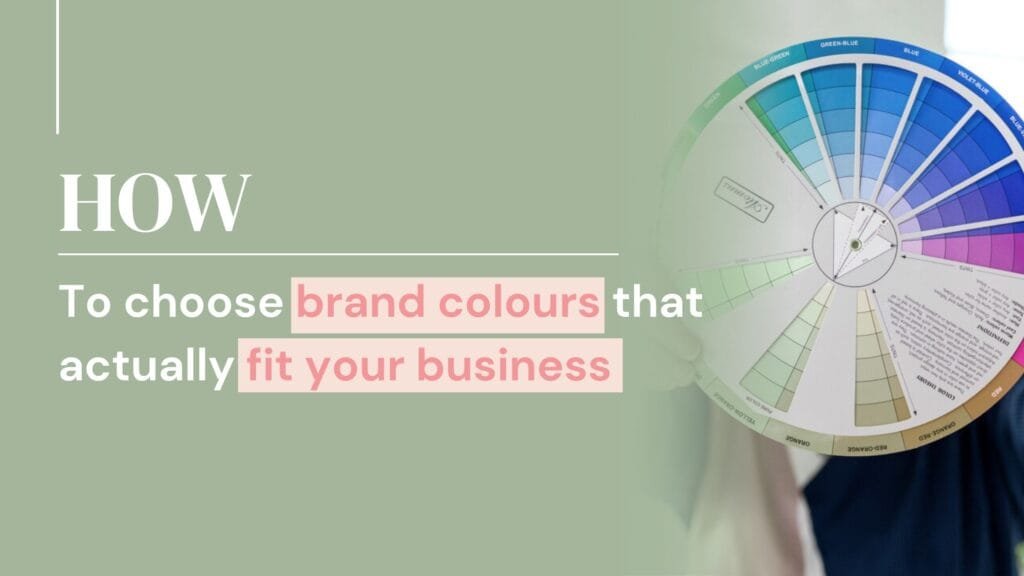
Use colour psychology in a simple way
Colour psychology doesn’t need to be complicated.
Every colour carries certain emotional associations. Some feel calming, others energising, others grounding or optimistic. You don’t need to memorise every meaning, just focus on the colours that match the eight words you defined earlier.
For each adjective or value, look at what colours tend to be associated with it. You’ll start to see patterns emerge.
Those patterns are far more useful than generic advice about what colours you should or shouldn’t use.
Narrow your options down
At this point, you’ll likely have two lists of colours. One based on instinct and brainstorming, and one informed by colour psychology.
Look at both lists together and highlight the colours that appear in both places. Even if a colour isn’t your personal favourite, if it appears in both lists it’s worth paying attention to.
These become your strongest contenders.
How many brand colours do you actually need
This is one of the most common questions I get.
You don’t need lots.
A good rule of thumb is one to three primary colours. These are the colours people will most associate with your brand.
You can then add secondary colours that support your main palette. These are usually used for accents, backgrounds, or highlights. Keeping this smaller rather than bigger helps your brand feel more recognisable and easier to use.
Choosing your primary brand colour
Start by selecting one main colour that best reflects your brand identity and values.
This colour should feel like the strongest representation of your brand. From there, you can explore different shades and tones of that colour to find one that really fits.
It can be useful to look at others in your industry at this stage. Many industries naturally lean towards certain colour families. You can choose to align with that, or deliberately move away from it if that better suits your brand.
The goal isn’t to copy. It’s to be intentional.
Adding secondary colours that work together
Once you have your primary colour, you can choose secondary colours that complement it.
There are a few simple approaches that work well.
You might choose colours that sit next to each other on the colour wheel for a softer, more cohesive feel. You could choose a contrasting colour for impact, or use lighter and darker shades of your main colour for consistency.
Whichever route you choose, make sure the colours work together rather than compete for attention.
Test your colour palette in real life
Before you commit, put your colours to the test.
Place them next to each other and imagine them across your website, social posts, and lead magnets. Ask yourself a few simple questions.
Do these colours feel like my brand? Would my ideal client feel drawn to this? Do they work together without feeling overwhelming?
If the answer is yes, you’ve done the work properly.
Bringing it back to alignment
Choosing brand colours isn’t about finding the trendiest palette. It’s about choosing colours that support your identity and help you show up consistently.
When your colours are aligned with who you are and who you help, everything else becomes easier. Design decisions take less time, content feels more cohesive, and your brand becomes easier to recognise.
If choosing brand colours feels overwhelming, or your current palette no longer fits the direction your business is heading, this is something I help business owners work through regularly.
We focus on alignment first, so your colours support your identity rather than fight against it.
Written by Nikki Clements, founder of Brand You, formerly Nikki Carter Designs. Known as the Lead Magnet Queen, Nikki helps coaches and service based businesses build aligned brands that support visibility, credibility, and sustainable growth.
Blogs
-
Canva vs Adobe vs Affinity: choosing the right design tools (and knowing when to get support)
-
Best free email marketing software for coaches in 2026
-
Do lead magnets actually work (and when they matter for your business)
-
How a lead magnet funnel helps your business grow
-
Lead magnet ideas for coaches that actually lead to clients
-
How to create a lead magnet that attracts the right clients
-
Lead magnet design myths: 5 misunderstandings that stop your lead magnet working
-
Lead magnet design: how to make visuals your audience actually uses
-
Logo file types explained: what they are and when to use them
-
What makes a great logo (and how to create one that actually works)
-
How to choose brand colours that actually fit your business
-
5 Simple branding tips you can implement today
-
Why brand identity is vital for your business
-
Visual branding that builds credibility for service-based businesses
-
13 Smart Ways to Promote Your Lead Magnet Effectively