If you’ve ever looked at your own branding and thought, “Something feels off, but I can’t put my finger on it”, you’re not alone.
Your business might be solid. You might know your stuff. You might even get great results for your clients.
But if your visuals don’t reflect that, it creates a quiet disconnect. And that disconnect shows up as hesitation, second guessing, and being overlooked.
This guide is here to explain what visual branding actually is, why it matters more than most people realise, and how it affects credibility, confidence, and trust long before you ever speak to a potential client.
Not in a fluffy way. In a real, practical, human one.
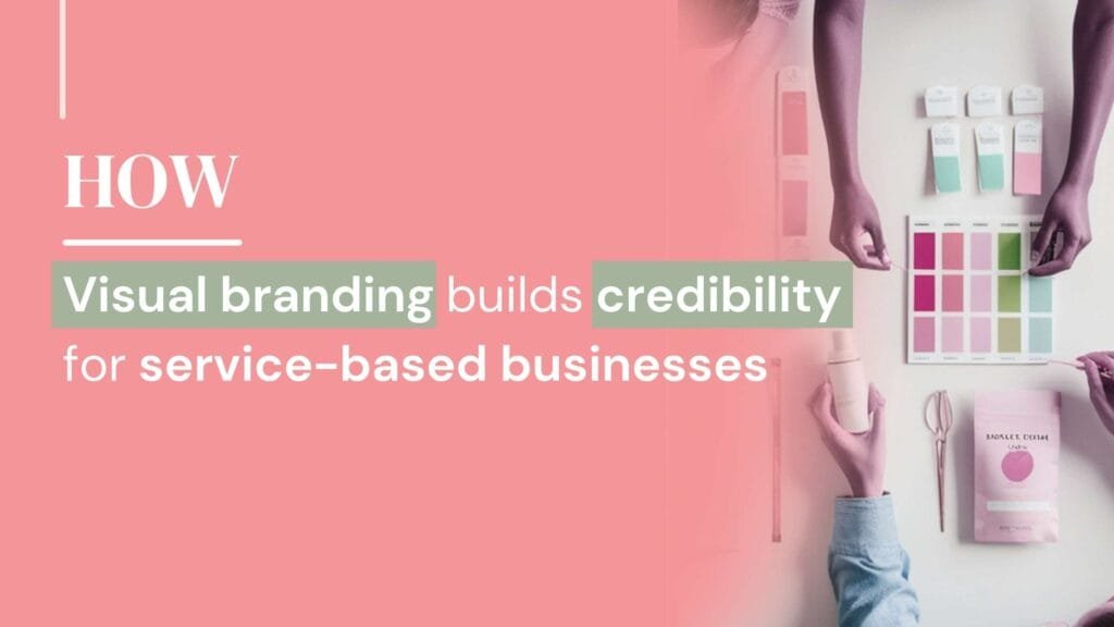
What is visual branding?
Visual branding is the visual system of your business. It includes your colours, fonts, layout choices, and design style, and it works together to communicate professionalism, clarity, and trust at a glance.
In simple terms, visual branding is what people feel about your business before they read a word.
It’s not about being trendy or flashy. It’s about alignment. When your visuals match who you are and how you work, people relax. They trust you faster. They take you seriously.
Think of it like walking into a well put together space. You might not consciously analyse the furniture, the lighting, or the layout, but you instantly know whether you feel comfortable being there. Your branding works the same way.
Why visual branding is important for credibility
Whether we like it or not, people make decisions quickly online.
Your website, social media, and marketing materials are often the first interaction someone has with your business. Before they read your about page or look at your services, they’ve already formed an impression.
If your branding looks inconsistent, outdated, or unclear, it creates friction. Not always enough for someone to leave straight away, but enough for them to hesitate. And hesitation is often the difference between someone enquiring or clicking away.
Visual branding acts like a silent introduction. It says, “I’m professional, I’m prepared, and I know what I’m doing”, before you ever say hello.
For service-based businesses, this matters even more. You’re not selling a physical product someone can pick up and inspect. You’re selling your expertise, your thinking, and your ability to guide someone. Your branding needs to support that, not quietly undermine it.
Start small, master your messaging, and repeat what performs. Consistency always outperforms scatter.
What makes a brand look credible, not just pretty
This is where a lot of businesses get stuck.
A brand can look nice and still lack credibility. Credibility doesn’t come from decoration, it comes from intention. From decisions that feel considered rather than accidental.
Consistency is the first pillar.
When your colours, fonts, and layouts are used in the same way across your website, social media, and documents, it creates stability. People may not consciously notice consistency, but they feel it. Inconsistent visuals create uncertainty, even if the content itself is strong.
Clarity is just as important.
If someone lands on your website and has to work hard to understand what you do, who you help, or why it matters, trust drops. Credible brands remove friction. They make things easy to grasp without oversimplifying.
Alignment plays a huge role too.
Your branding should reflect your audience and your positioning. A mismatch here is like wearing the wrong outfit to an important meeting. You might still be capable, but it doesn’t land the way you want it to.
Restraint is often overlooked.
Credible brands don’t try to say everything at once. They don’t use every colour, every font, or every trend. They’re confident enough to keep things simple and intentional.
Credibility comes from cohesion. Everything working together quietly, without shouting for attention.

Find out what makes a good lead magnet and what does on our free webinar
Visual branding vs logo design
A logo is part of your brand, but it is not the whole thing.
A logo is like your signature. Recognisable, useful, but meaningless on its own without context.
Visual branding includes how that logo shows up everywhere else. The colours that support it. The typography that sits alongside it. The spacing, layout, and visual rules that make everything feel connected.
This is why “just getting a logo” rarely fixes the problem. If the rest of your visuals are inconsistent or unclear, the logo has nothing to anchor to. It’s like framing a beautiful picture and hanging it in a cluttered room. The picture hasn’t changed, but its impact has.
A strong visual brand gives your logo a home. A system it belongs to. A reason it makes sense.
Why visual branding affects confidence
This is the part people don’t talk about enough.
When your branding doesn’t feel right, it chips away at your confidence in small, persistent ways. You might avoid posting because you don’t like how things look. You might overthink every piece of content. You might hold back from opportunities because you don’t feel ready to be seen.
That’s not a mindset issue. That’s a mismatch.
Confidence often comes after clarity. When your visuals reflect who you are and how you work, showing up feels easier. You’re not pretending. You’re not apologising for your presence. You’re simply visible in a way that feels aligned.
It’s like wearing clothes that actually fit you. You stop adjusting. You stop hiding. You move through the day differently.
DIY branding, Canva, and the reality for small businesses
Canva isn’t the enemy. It’s a tool.
Used well, it can be incredibly helpful, especially in the early stages of a business. But tools don’t create strategy, and they don’t replace design understanding.
DIY branding often reaches a ceiling. At first, it feels empowering. Then it starts to feel frustrating. You tweak endlessly. You change colours. You swap fonts. You start again because nothing quite feels right.
That doesn’t mean you’ve failed. It usually means you’ve outgrown improvising.
Design is a skill, just like copywriting or photography. Having access to the tools doesn’t automatically give you the structure, rules, and experience to use them effectively. And that’s okay.
There’s no shame in starting DIY. The issue comes when you expect DIY tools to solve strategic problems they weren’t designed to fix.
When is the right time to invest in visual branding?
There isn’t a single “correct” moment, but there are clear signs.
You’ve evolved, but your branding hasn’t.
Your business has grown, but your visuals still reflect an earlier version of you.
You feel uncomfortable being visible.
Not because you lack confidence, but because your brand doesn’t feel like it fits anymore.
You’re attracting the wrong enquiries.
Your branding might not be clearly signalling who you’re for.
You’re ready to be taken more seriously.
By clients, collaborators, or yourself.
Sometimes this calls for a full rebrand. Sometimes it’s about refining what’s already there. The key is knowing the difference, rather than throwing everything out and starting from scratch unnecessarily.
Real-world scenarios people recognise
This is often where things click.
You delay launching something because you don’t want to design the graphics.
You avoid sharing your website link because it feels outdated.
You second guess opportunities because you don’t feel “professional enough” yet.
You keep tweaking visuals instead of focusing on the work that actually grows your business.
These aren’t personal flaws. They’re signals that your branding isn’t supporting you the way it should.
When your visual branding is clear, these moments soften. You stop fighting your own materials and start using them.
What visual branding typically includes
Visual branding is a system, not a collection of random assets.
It usually includes a defined colour palette, carefully chosen fonts, layout and spacing rules, and design styles that work together consistently.
It also includes templates and guidelines that make it easier to show up without reinventing the wheel every time.
When this system is in place, everything else becomes simpler. Content creation feels easier. Marketing feels more cohesive. Visibility feels less draining.
How visual branding supports visibility and marketing
Good branding doesn’t do the work for you, but it makes the work you do more effective.
When your visuals are consistent, people recognise you faster. When your brand feels clear, your message lands more easily. When everything looks connected, trust builds over time.
This is where branding supports content, lead magnets, and systems. It creates the container that allows those tools to work properly, rather than feeling disjointed or forced.
Branding doesn’t replace strategy, but without it, strategy has to work much harder.
Branding as clarity, not perfection
Visual branding isn’t about getting everything perfect. It’s about creating enough clarity that you can show up without hesitation.
It’s about removing friction, not adding pressure. Supporting your confidence, not testing it. Helping people understand you quickly and trust you sooner.
When branding is done well, it fades into the background in the best possible way. It stops being something you fight with and starts being something that quietly does its job.
And that’s when visibility starts to feel lighter.
Blogs
-
Canva vs Adobe vs Affinity: choosing the right design tools (and knowing when to get support)
-
Best free email marketing software for coaches in 2026
-
Do lead magnets actually work (and when they matter for your business)
-
How a lead magnet funnel helps your business grow
-
Lead magnet ideas for coaches that actually lead to clients
-
How to create a lead magnet that attracts the right clients
-
Lead magnet design myths: 5 misunderstandings that stop your lead magnet working
-
Lead magnet design: how to make visuals your audience actually uses
-
Logo file types explained: what they are and when to use them
-
What makes a great logo (and how to create one that actually works)
-
How to choose brand colours that actually fit your business
-
5 Simple branding tips you can implement today
-
Why brand identity is vital for your business
-
Visual branding that builds credibility for service-based businesses
-
13 Smart Ways to Promote Your Lead Magnet Effectively